Little Green Apple recently completed a brand development for Bayside Podiatry in Edithvale, Victoria.
The clinic hadn’t refreshed their logo for 12 years so it was a timely exercise to refresh their brand before they renovated their premises. Their brief was to create a bold corporate identity that would engage new and existing clients along the journey of their rebrand. The business directors wanted to encapsulate both the nature of their business – podiatry – and their bayside location through the new branding.
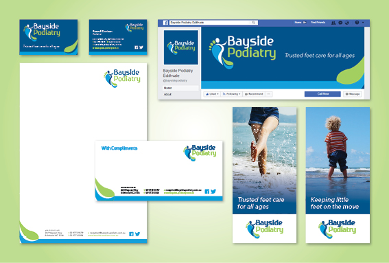
The end result features an icon in an abstract design of a foot sole, formed by wave-like elements to represent the Bayside location and name of the business. The navy lines also form an abstract person with their arm reaching upwards on the right side of the icon. This represents a sense of movement that can be achieved through care at Bayside Podiatry. The ‘big toe’ forms the head of the person, with the other toes reflecting a family or the range of clients that the clinic treats.
The blue and green tones applied represent the colours associated with the tranquil waves of Port Phillip Bay.
The clinic itself will be repainted to match the brand colour palette, and new facade/window signage will complete the transformation.
Have you got a logo that is screaming for a refresh?
If so, I’d love to help you. There’s nothing more exciting than starting the New Year with a new brand to represent your business. Contact me for further information.
